
Whenever I look at anything with words on it, I look at the typography. Bring me to a local corner lunch cafe with a menu typed out and printed from Microsoft Word and I will have a field day. I would judge even more harshly at a more expensive restaurant. I can’t help it as I—like most designers, I’m sure—just look at everything with a critical eye.
My biggest typographical pet peeve is the rendering of apostrophes, single and double quotes.
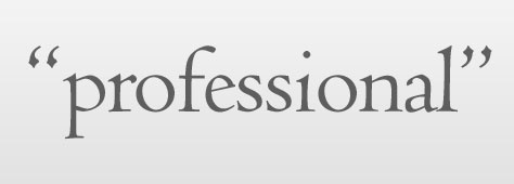
It astounds me when I notice this on any piece, and all I can mutter to myself is “Where is the craftsmanship?!” This was not the case decades ago when copy was sent out to professional typesetters. The very thing that democratized graphic design was the the same thing that lowered the bar on what passes for “professional” graphic design. I’m talking about how the computer and software allowed more people access to the tools necessary to create great looking stuff. No longer did designers need to send out manuscripts to a typesetter who would in turn set the type into galleys for the designer to paste up in the mechanical. This spawned a whole new industry called desktop publishing, but killed the entire profession of typesetter, and along with it some higher standards.
Don’t get me wrong. I’m no luddite. I put myself through college by working at a desktop publishing service bureau. But because I had some great teachers, and because of my sometimes unhealthy attention to detail, I had a lot of respect for typography, thus taking the time to learn all the rules and standards. But I digress.
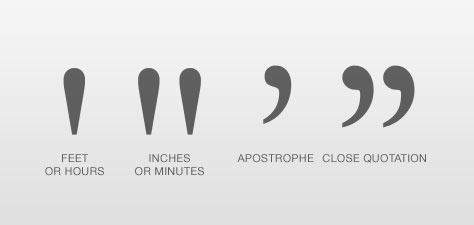
What passes sometimes today for single and double quotation marks are actually foot and inch marks (or hour and minute marks). Why is that? My theory is that to be efficient in the manufacturing of some of the first practical typewriters, they straightened out the quotation marks so they could be dual purpose—open and close. In fact in Christopher Sholes’ patent for the QWERTY keyboard, only a single straight apostrophe key is shown, presumably the user would strike the key twice for a double quotation mark. And of course, most of this layout made its way into our modern computer keyboards and software.

Software companies like Microsoft and Adobe have been trying to mitigate this error by employing “smart quotes” technology. The software will analyze whether the quotation mark is at the beginning of the word (and then use the open state) or the end of the word (and use the close state). Most the time this actually works well. But what happens when you need to use an apostrophe in its close state as a contraction replacement in words like ’Til, Rock ’n’ Roll, and mac ’n’ cheese? The software isn’t smart enough to replace it with the proper close state and the designer or brand ends up looking amateurish.

How to not look like an amateur designer? (OK, maybe amateur could be considered a harsh term to you pros. Maybe bad craft is what I’m really talking about.) Go ahead and turn on the smart quotes feature of your favorite design app, but pay attention and override when necessary.
| Glyph | Description | Mac | Windows |
|---|---|---|---|
| ‘ | Open single quote | OPTION-] | ALT-0-1-4-5 |
| ’ | Close single quote (apostrophe) | SHIFT-OPTION-] | ALT-0-1-4-6 |
| “ | Open double quote | OPTION-[ | ALT-0-1-4-7 |
| ” | Close double quote | SHIFT-OPTION-[ | ALT-0-1-4-8 |